Experimentation Platform
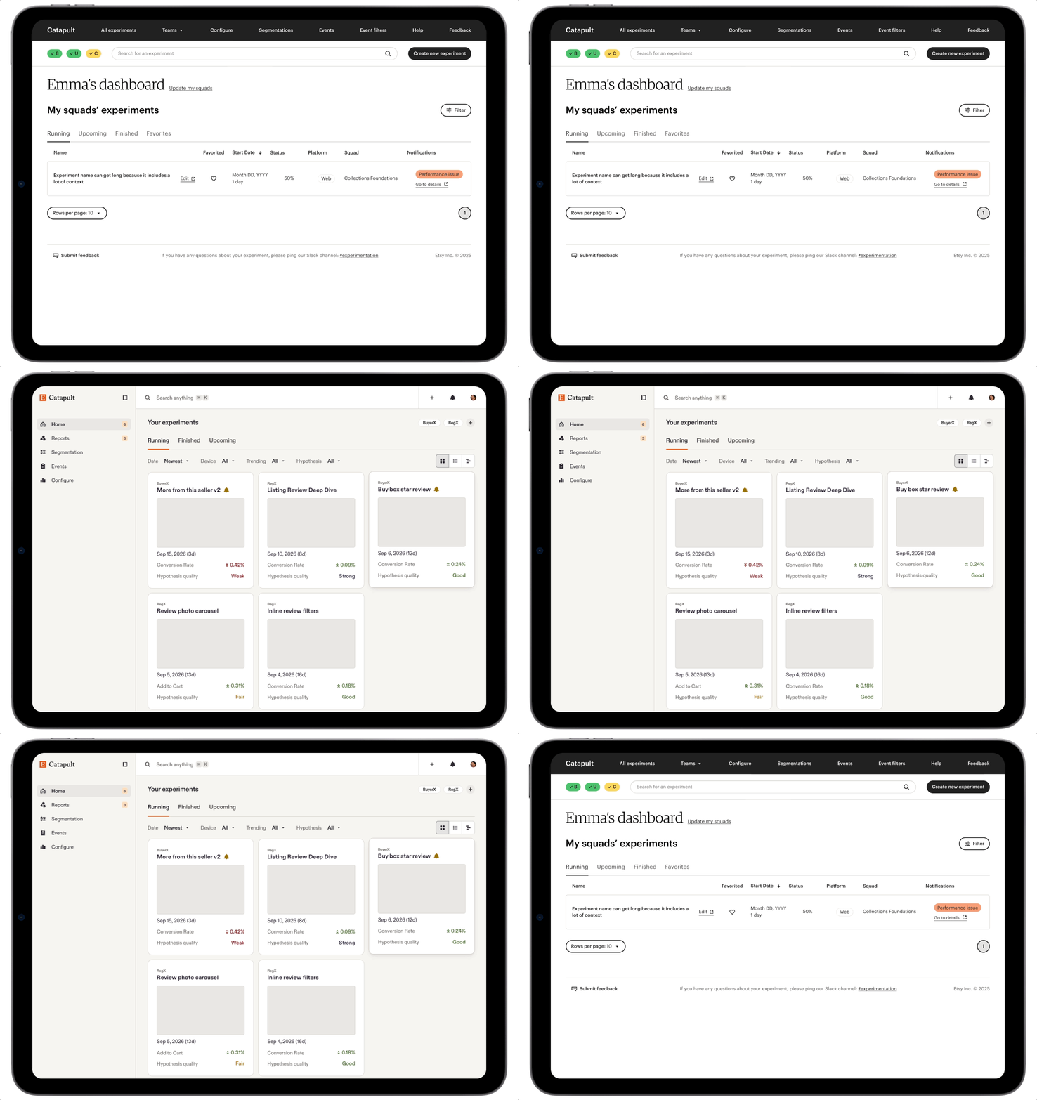
Catapult, Etsy's internal platform for running and evaluating product experiments, was used constantly but had never had dedicated design investment, and for part of the year it had no PM. I stepped in to set the product vision and hold the team's operating structure together.
Our insight was clear: experiment health drives better product decisions through set up, evaluation, and history. Better documentation produces better learnings, better learnings build a trustworthy record, and that record shapes where we invest next.
Role
Staff Product Designer, functioning as squad Product Manager
Research lead across users, initiative leads, and executive leadership
Systems design — site map, service design blueprint
Team operations — sprint cadence, check-ins, work tracking
Impact
90% conclusion completion, up from 50%
+15% hypothesis quality score
5 improvements shipped to the experiment details page in one quarter
3 levels of the org researched, from daily users to executives
Tooling
Utilized Claude to turn raw research notes into testable hypotheses tied to company outcomes, and to define measurable benchmarks like engagement.
Leveraged a Figma-based design system in combination with Cursor to rapid-prototype the platform vision and feature concepts.
Challenges & Solutions
Experiment Hygiene
Experiments launched with vague hypotheses and inconsistent metrics, so their intent was unclear. We added AI grading of hypotheses and conclusions against criteria the product team defined, a nudge toward better-formed experiments.
Evaluation
Key data was buried in hover states, and the metrics table couldn't be filtered, sorted, or searched. I rebuilt it in plain language with filter, sort, and search, and reordered the page around what users need first.
Historical Context
Poor metadata made past learnings slow to find, with no confidence the search was complete. We linked related experiments into a parent-child chain and added AI summaries of product docs, so teams can see the story behind the current test.
leading through ambiguity
Work went untracked, and decisions leaned on assumptions instead of evidence. I introduced a regular cadence and work tracking with the squad and leadership. Turned research across three levels of the org into the Q3 roadmap that aligned stakeholders.
What shipped
Following the Q3 roadmap, the team shipped a redesigned experiment details page — filterable metrics, parent-child experiment linking, an AI-generated summary of product documents, an AI-generated score for the hypothesis and conclusion, and a reworked page hierarchy to surface what actually mattered most.